Thursday 17 August 2023

Diploma Module 1 Chapter 6 3rd dyeing session

 It took me 3 different dyeing sessions to achieve the result I'm more or less happy with.

I started by dyeing different fabrics, all coton (coton poplin, scrim, linen) with Procion warm yellow, then put these in the dirty pot (water kept from Eco printing with vinegar and rust water in it), heated it up and left the fabric in it for about 1 hour. I then gave it a good rinse and as I still wasn't happy, overdyed it with lemon yellow


This gave me a mixture of a greenish yellow with grey  in it.

While looking for suitable threads I also found small pieces of felt and a wool jumper with the right colors


Different threads in my stock, some where recently bought at the Festival of Quilts, some I already had. I can't wait to start stitching


Tuesday 15 August 2023

Diploma Module 1 Colouring papers

Some of my papers. These were mostly done on a big Gelli plate  with the goal to achieve a weathered look consisting of different layers of paint. The inspiration here were the textures I registered previously. I also used the textured plates to do some rubbings with wax crayons.
For the designing task I wanted to use copies of the papers, however I wasn't very happy with how my printer printed these. I ended up by using the originals


Saturday 12 August 2023

Diploma Module 1 Chapter 6 second dyeing session

 The goal in this dyeing session was to achieve that dirty kind of yellow of my colour scheme.

I started by mixing a strong mixture of golden yellow and black to use for mixing with the approx 250 ml of soda ash/salt solution.

Here's the yellow resulting fabric with the pure yellow used. Again the photograph doesn't render the true colour. The real colour is more yellow but a bit pale because I diluted it to much. 


I then made a mixture of 5 tablespoons of yellow to 1 tablespoon of black. As expected the resulting fabric was green, I should have known this from the start but it was worth the try


The next mixture was done with equal parts yellow and black. The resulting fabrics turned out to be more of a blueish grey. It was interesting to see that the linen fabrics or with more linen content turned out to look "greyer" than the coton ones.


Just for fun I made a badge of fabric with 3 tablespoons of black and after 20 minutes I added some walnut brown, also Procion but a special mixture by Hilary Beattie. The result is quite nice but  not really fitting into my colour scheme


Conclusion
The goal to dye a dirty mustardy yellow wasn't reached. I have to find another method.

In terms of dyeing grey, it seems to be very difficult even if diluting the black. the greys achieved by mixing brown with a bit of cobalt blue were more successful.
Here eco dyeing might help, I remember having dyed grey fabric with artichokes and they were really grey. 
I will probably try to overdye yellow in the dirty pot.

Fabrics dyed with staghorn, no vinegar or rust added. The sheer silk organza (1st one) took the colour best


Different silks and wools dyed with Saphire blue acid dye


Friday 11 August 2023

Diploma Module 1 Chapter 6 Colouring materials


This is the colour scheme I chose for this Module, it's  not the easiest to work with and rust and turquoise would probably have been the obvious choice, especially for my theme, but I had already chosen these 2 colours for one of my Certificate modules, I decided to challenge myself.


 I first was tempted to use transfer paints for my colouring method, but they are hard to find here and due to taxes it has become to expensive to order in the UK. I have some paints here and will certainly experiment with them because working with synthetics will give me more options further in the module.

My first step was to go through my existing stash to see if I could find fabrics I could overdye. 

Blue

This is more of a primary Cyan blue, but I hoped that I could achieve a similar colour by overdying  fabric my mixing Cobald blue and midnight blue. I failed (although this is not visible on the pictures below, sorry the camera somehow altered the colours)Of course this blue might work, but it's not the blue I was aiming for. I'm conscious that stitching over the fabrics with the "right" blue might create the effect I wanted. But I will probably try to get a Procion blue that will work. 


 Beige

I still a little bit of a Procion colour called "ecru" left which I wanted to use to dye the light beige of my colour scheme


The result was satisfying only that I probably won't be able to reproduce the colour as I don't have any dye left, another option has to be found.

Grey

To get the grey I wanted I did little experiment, I mixed warm brown with a little bit of cobalt blue. The resulting colour is very pleasing, although with a light greenish tint. For both of the three colours I used the plastic bag method, the fabrics used were coton, poplin and lightweight as well as a  bit of printed commercial fabric.


The I remembered my eco dying experiments from the previous two years.

These are mainly silks but also some linen and coton. These are the colours that come closest to my colour scheme, only that I probably won't be able to reproduce the same except maybe for the grey which can be dyed in the dirty pot with some rust in it.


Tuesday 8 August 2023

Diploma Chapter 4 Shape and Pattern Study 2

I chose the iron beam as shape to experiment with. I changed the proportions to make it look more interesting. However a bit further in this Chapter I realized that the design was still to square and that a more organic one would open up more possibilities .

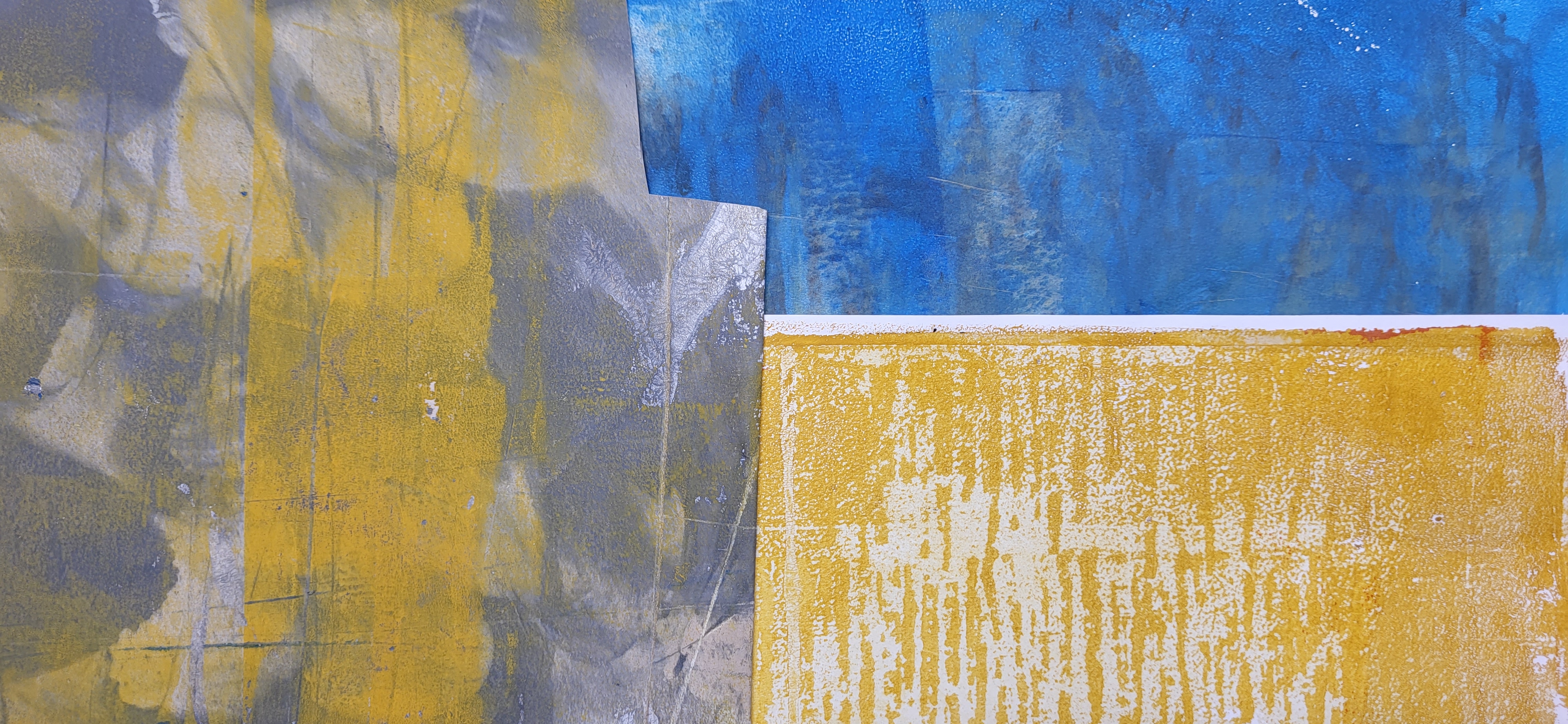
For this design exercise I also started by painting the papers I would use. The inspiration for these were my textures, the plates were used to make rubbings with wax crayons or served as inspiration. Using my big Gelli plate enabled me to achieve the textured backgrounds on the papers as well as the worn look of the industrial site. 
One of the techniques used was drawing patterns onto a piece of paper with wax crayons (Pentel) these formed a kind of resist on the plate and were printed with a different paint. 
For another background I used baby powder as a resist . It would be nice if I could reproduce the same on fabric but some of the effects can only be reached by using acrylic paints which leave a (plastic) shine on the fabric.

I tried to copy the papers and keep the originals for a later stage but wasn't happy with the results and they didn't translate the real beauty of the papers. So I used mainly the originals.

When doing the exercises in this Chapter the magic really happened when both the shapes and the backgrounds were done using the painted papers. 

I certainly could have continued to go on designing even more, but as always at some stage you have to decide when to stop and move on. More ideas might pop up in the future.


2

2 Sample 1 pressed onto small gelli plate rolled over with white acrylic pain which caused the 1st layer to smear, then printed


3


3a


4

4


6
Shape slightly changed, still to square


8

Rubbing over sample 5 to reveal the outline, shapes filled with inktense blocks
9


10
Shape placed on coloured background, rectangle cut out and replaced, colours of background changed
void rectangle covered from the back with painted paper
11
11 Shape glued to coloured background divided in 4 with a contrasting narrow strip of paper in a cruciform
This looks more like a wrapped present, but isolates parts of the shapes that could lead to a different design


12


14

Shape with "M" like Minette written over it
This sample would probably look more interesting if the background paper wasn't white

15

Shape placed on contrasting background, pleated lengthwise, shape outline drawn over the resulting shape got filles with stripes. This creates like a distorted shape, a kind of halo or shadow of the main shape


The text to the following picture is the explanation that goes with 16 a.

16a

16a


I then simplified the shape with the  Adobe Capture App on my cell phone before  scanning it into the Silhouette program. The designer edition allows you to rotate it around a specific shape varying the overlapping and the number of shapes used. You can fill the shapes with more or less solid colours but in the following samples I prefered to colour them  myself before gluieing onto a pieced background.


21


Isolating shapes from 20 and 21 using transparent paper

22

Shape arranged in rows, overlapping and welded in Silhouette.
This could result into a lacy stitching, interesting edges

More designs done in the Silhoue program