Monday 4 December 2023

Diploma - Chapter 12 - Towards an Embroidered Item - Choose background-Colour background-Add detail and pattern with stitching

 For this exercise I chose a neutral coloured coton in a grey/brown tone, knowing that, at least for the first fabric I would cover most of it.

This background fabric was then covered with Bondaweb which I pealed off before layering it with different fabrics and threads.

Fabric  1


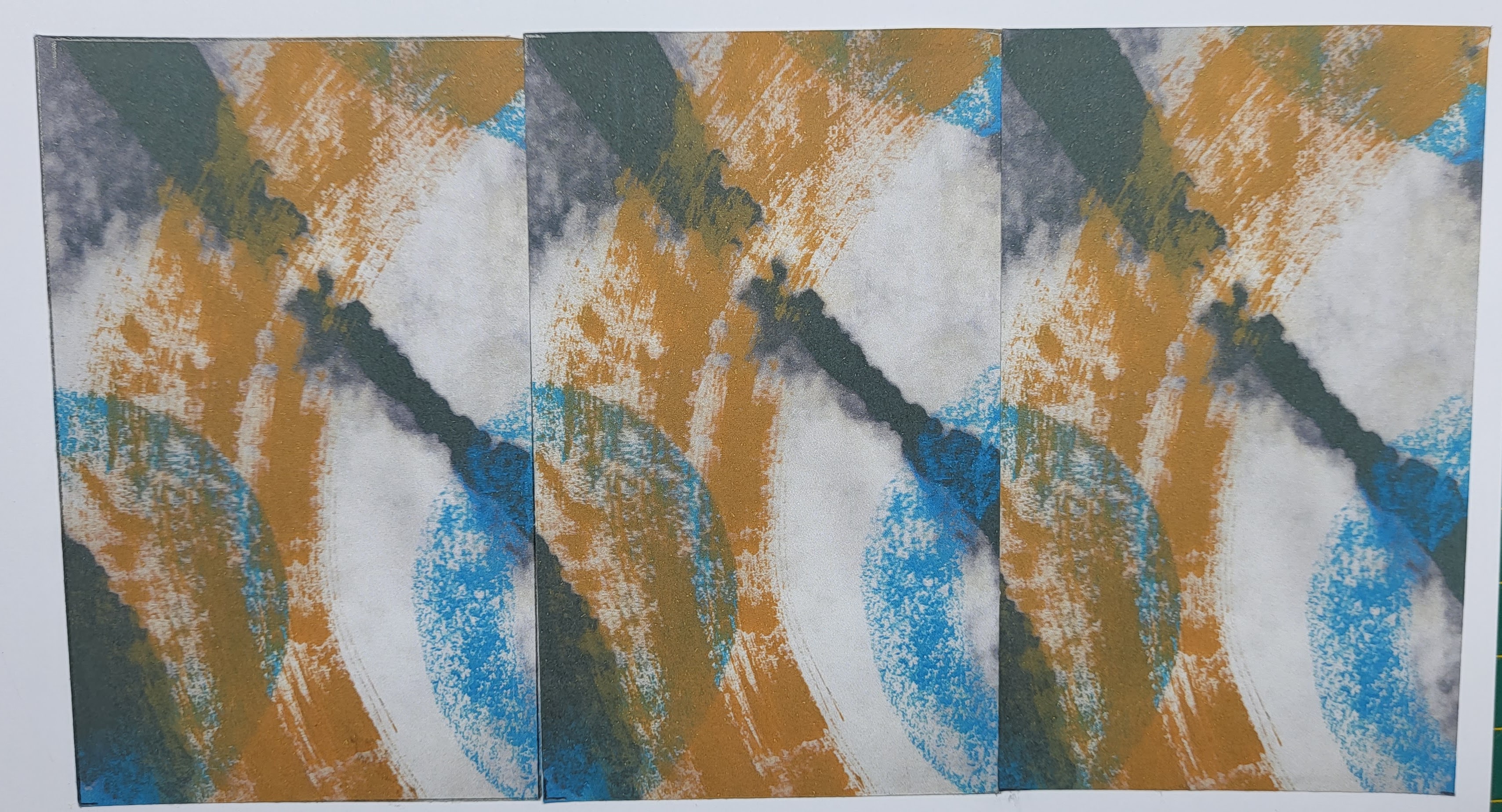
Here the background got covered with different fabrics in a stripy pattern, knowing that the surface would be cut up and that this pattern would "disappear".

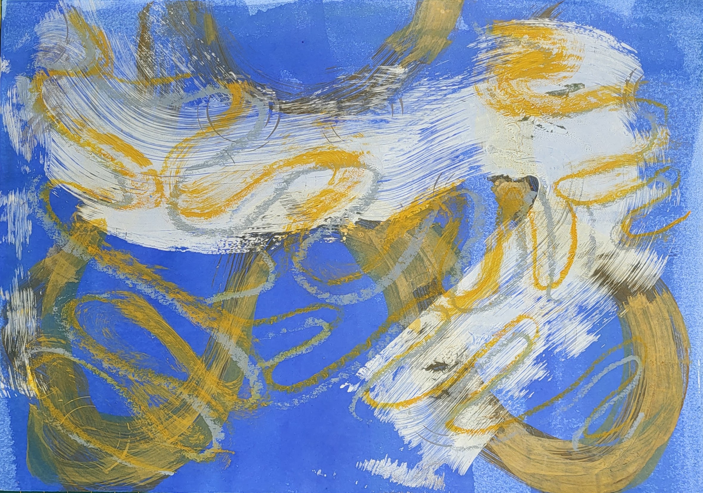
The main focus definitely lies here on the blue stripe which consists of a prefelt with dry  snippets of mustardy macramée threads from another project, felted in with the embellisher from both sides

The other stripes consist of fabrics in different tones of yellow or beige. The stripes were then fixed onto the background with a hot iron. 

Stitching was added with free machine zigzag in blue in a pattern inspired by one of the shapes from the previous chapters, more straight machine stitching was added in blue and yellow as well as a "normal" zigzag stitch in a horizontal grid.


Fabric 2


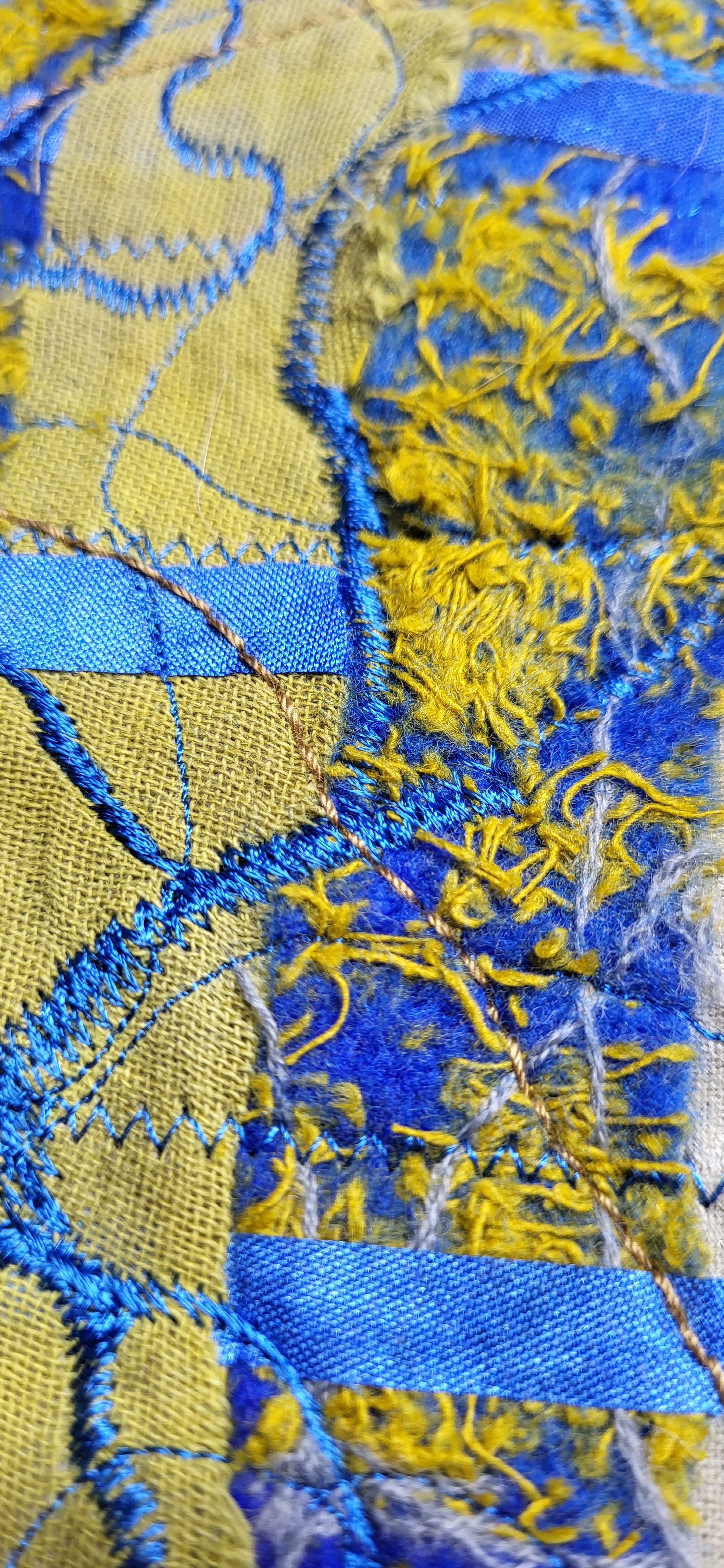
For this second fabric different snippets of fabrics were layered in a random way. They consist of a beige sheer silk, scrim, grey and light brown coton, acrylic painted yellow fabric, grey painted bondaweb as well as loosely layered threads in grey and yellow. The whole background was then stitched with mostly automatic swirly patterns in grey/beige. The thread is of a thicker quality so  is a little bit raised from the surface. As a last layer some free motion stitching was added in the same blue than in Fabric 1 with the goal to create some kind of link between the 2 fabrics.

  The main goal was to create two different, contrasting surfaces that were of a different colour scheme, but linked


Sunday 26 November 2023

Diploma Chapter 11 - Bold Design Development - Option D

 This was the first of the two exercises I worked on, as the painterly approach attracted me more. 

The chosen format for the painted papers was an A4 page.

I tried to reproduce the shapes used previously  using different mediums such as acrylic paints or wax crayons or shunky acrylic markers, enlarging the shapes and overlapping them. I thus achieved different textures and quality of the marks made (big and bold with finer lines). Some of the backgrounds were created with the gelli plate as this allowed for a quick coverage of a whole page. 

I copied the original papers which unfortunately changed the colours, in fact they appear duller and darker as they really are.


Marks made by painting on the gelli plate  with a big brush
curved lines with papers showing textures with rubbings.


bleached bold mark on black background, painted yellow half circle with blue circles drawn with a wax crayon.

Sample 1) 

cut in 4 sections, each one representing an interesting design


The following samples were taken from 1b

1c: detail repeated 3 times vertically 


Sample 2


Sample 3


3c : woven strips of  2 different papers, the blue clearly becoming the more dominant one


Sample 4


Sample 5


Friday 24 November 2023

Diploma Chapter 10 - Design Exploration - With Image Copies - Option C

I really enjoyed this design approach as it has great potential. If you're stuck this is definitely a way to get inspired.

I chose four designs with different metal tubes but also a picture with discarded rubber material to paint. They were printed in black and white on my laser copier because I thought that the ink would run, had I used an inkjet printer. However this meant that the blue or yellow paint didn't seep through to the back. Somehow the ink of the laser printed acted as a resist. Also it was somewhat difficult to paint on top. I mostly used wax crayons (Pentel) or Neocolor Aquarelle II to get the best effects.

Because I didn't want to use up my precious originals I used copies but instead of making a photocopy I took a picture of the painting and then printed it. This gave me better colours to play with. I was amazed as to the results of the prints. They offered a lot of textures and depth. I probably overdid the painting when it came to adding details but enjoyed the process. I love the prints as they are. The photo completely changed rendering the original motiv unrecognizable.