For some of the papers (especially the "dotted" ones) it proved difficult for me to represent them in fabric. I found that, although I liked them, the backgrounds were too plain to translate them into embroidery. This explains why I tried to use different techniques and materials to make the background look more interesting before adding the embroidery.
I really fell into a rabbit hole here and found immense pleasure in trying out different techniques which explains why it took me so long to finish this exercise.
I also wanted to use materials I could distress like kunin felt or polyester organza,but also coton scrim which made that some samples turned out lightweight and transparent.
I really love how some samples turned out, while I find that some look a bit boring.
For me, the big question is how to put everything together to form a cohesive piece of work. I have the feeling that to achieve this, it might be easier to use more or less the same fabric or the same technique and variations of it.
I realize that I have to introduce a complementary color as already discussed with you before . I concentrated on the papers of 2 designs "a" and "l", which I have to enlarge.
Maybe I could introduce, as suggested by you, this complementary color between the different strips in sample "a", by using insertion stitches or something similar, I'm thinking of machine stitched cords, strips of fabric, something which is a bit larger than a thread. This could also underline the "airy", lightweight feel to some of the fabrics....


Paper B


Paper C


Paper E


Looking back at this sample, I realize that I have to add more stitching to it. I love the embedded threads but I think that this sample lacks a bit of interest

Paper F


Paper G: Samples below done for the middle stripe in the paper


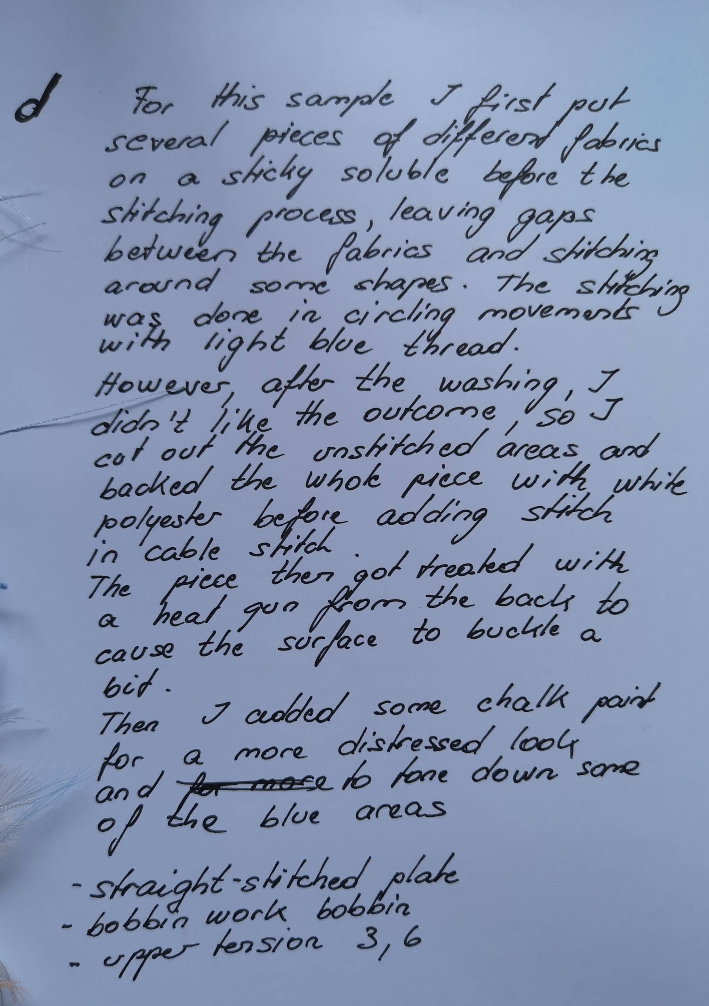
Although the sample below was originally done for Paper E, I think it definitely fits in better for Paper G in terms of color scheme. The labelling isn't correct and should read "d" instead of "e"