Wednesday, 28 July 2021

Module 6 - Translating A5 into A3 colored designs

 In this design exercise I used the original papers, except for the reverse papers.

I realized that there's not a lot (enough?) contrast in terms of complementary colors, in my paper samples, except for sample "b". This is something I might have to adjust when translating into fabric and in case I can't achieve enough contrast in texture and value.

Translating the black and white squares into a rectangle was a bit challenging and somehow changed the look of the colored samples 


Sample a: I'm quite attracted by this simple design as it would give me the opportunity to translate the gradual bleaching and decay in the different stripes


Sample b: This is a more complex design, which I find quite attractive. I replaced the background paper by a painted cellophane. On the last two pics I put a colored paper under the cellophane which gives more depth to the background. 


Sample f: the paper used in the first part of this sample shows different textures which makes it more interesting. This sample doesn't really speak to me, maybe because I couldn't see its potential until now 


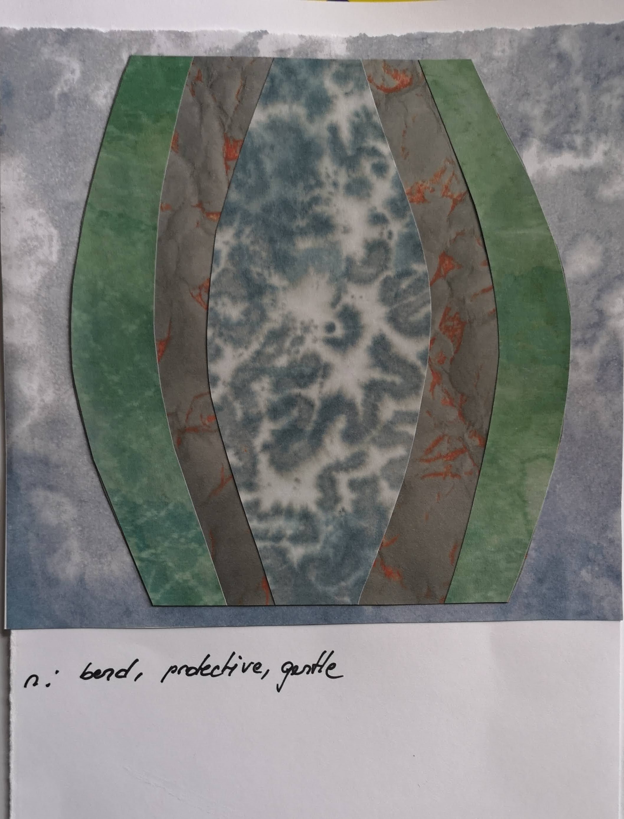
Sample n: blowing this sample up to a A3 size didn't make it better. I find that this design is not very attractive and I can't really say why, maybe because of the big central part😏


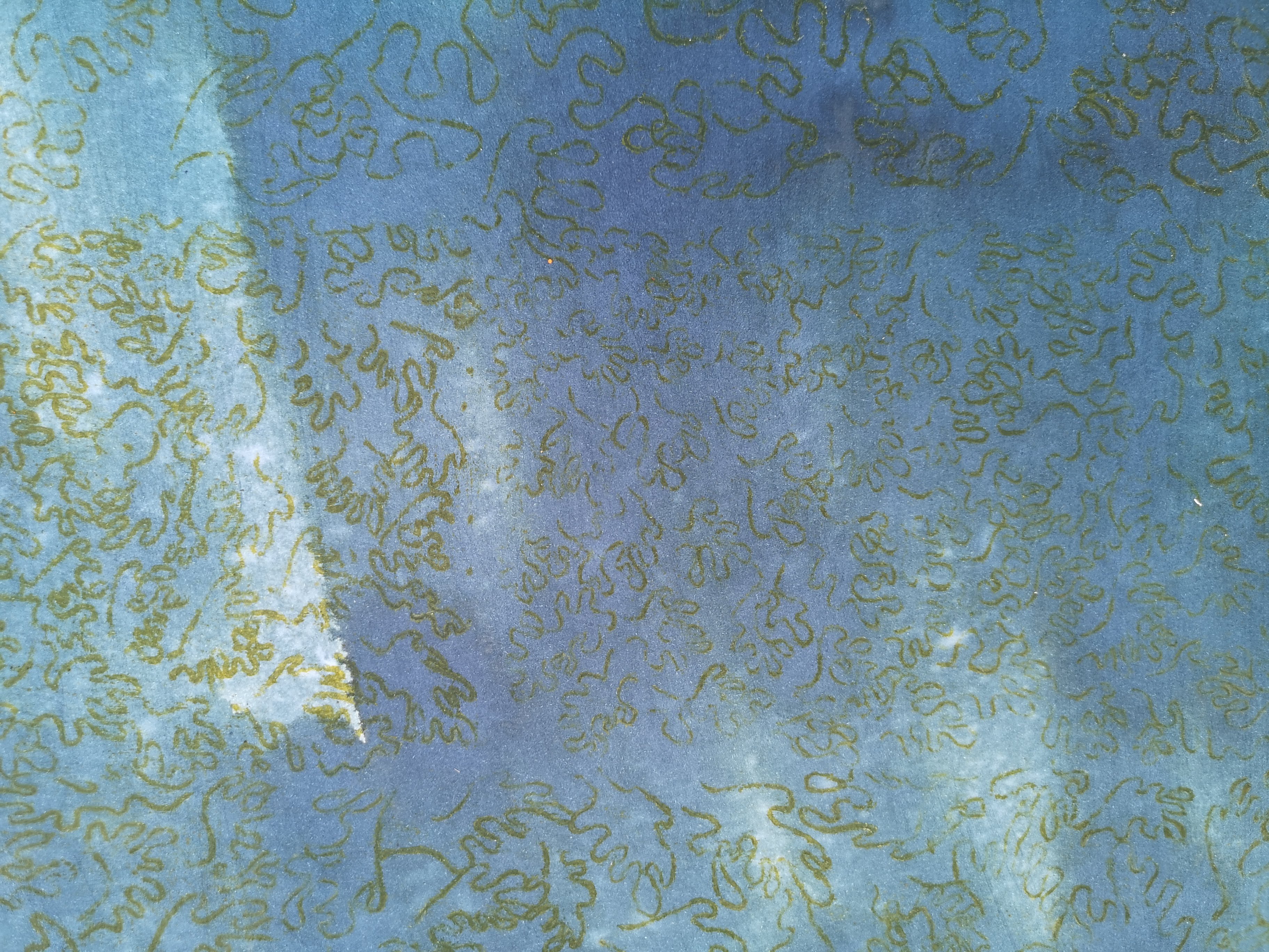
Sample l: in this last sample I used a new paper consisting of a screen printed fish pattern which is supposed to symbolize the rich animal life in the coral reefs. Although the design is very simple and few papers were used, I quite like it.


Tuesday, 27 July 2021

Module 6 - Translating black and white designs into A5 colored designs

For this part of the designing exercise, I made photocopies of my colored papers as I wanted to keep the originals for the A3 samples. Unfortunately the colors on the copies don't reflect what they really look like.


Sunday, 27 June 2021

I chose different greens and blues for my color scheme with some orange and  brown/purple as  contrasting, warmer colors, but also because purple is the color used for mourning in our culture, I wanted to use brown to represent decay, in this case of the corals. Green and blue is used for the water and the aquamarine environment, but I didn't want to use lively colors as these would have been too joyous to me. I also tried to vary the tonal values of the colors to have the choice between darker and lighter colors.
The colors used to paint the papers are mainly Procion dyes. The idea was that I could take the same colors to dye the fabric if needed. Colors and mixed: cobalt blue, lemon yellow, midnight blue, brown. Sometimes I added fluid acrylics if needed to the mixture.
Papers used: photocopy paper and heavier multimedia paper, tissue paper. Sometimes the reverse of the photocopy paper produces even more interesting effects as shown below.


Greens/blues
Light Purple with orange
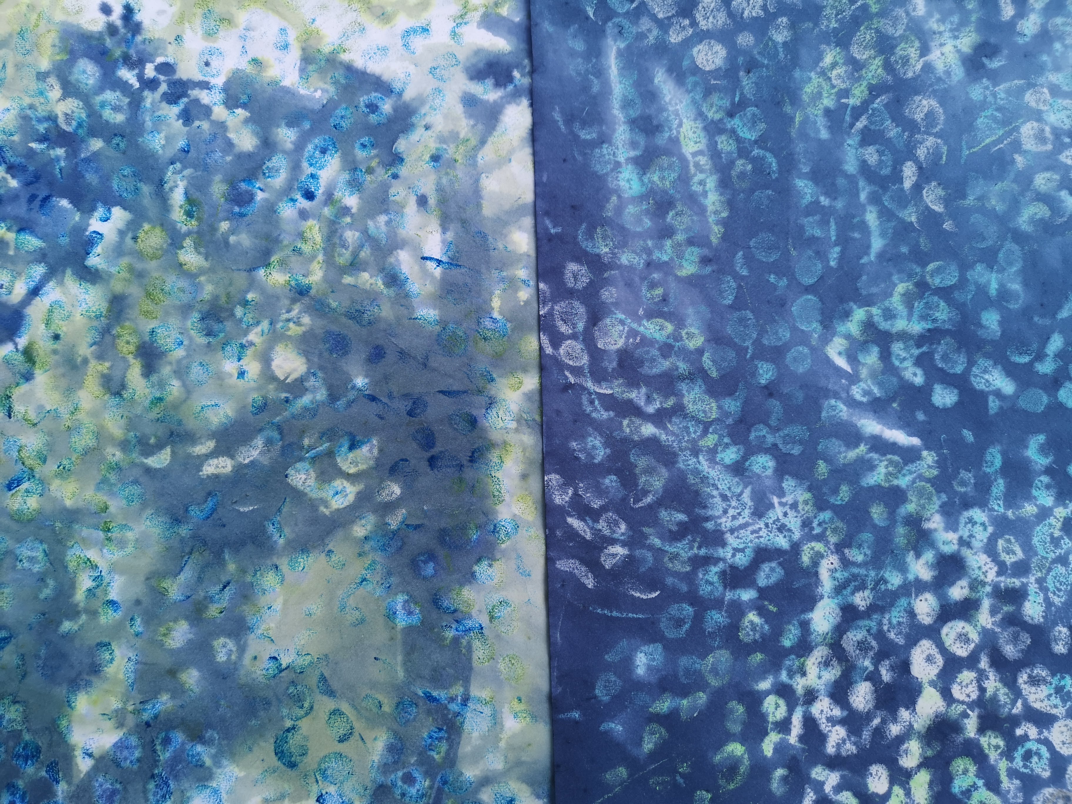
Blues/turquoise: left: discharged papers, right : papers treated with acrylic paint overpainted with fluid Procion dyes
a: Blue, discharged, overpainted with light green


b and c: a darker set of papers: above: tissue paper with rubbing and overpainting
underneath: indirect printing by drawing the shapes on a piece of paper with the the underside painted with waxed crayon
d, e, f:Rubbing and stamping on cartridge paper, overpainted with fluid dyes
The reverse of these stamped lightweight papers might even be more interesting


g: Rubbing of tissue paper over netting then glued on painted background with tissue partially overlapping
h: Painted paper with little circles drawn with wax crayon
i: pleated paper with wax crayon and overpainting with fluid Procion dyes
j: crumpled paper rubbed with wax crayon overpainted with fluid Procion dyes
k: painted background and stamped with selfmade foam stamp with acrylic paint
l: stamped with acrylic paint, floaded with Procion dyes, sprinkled with salt to produce additional background marks
m: overprinted cartridge paper


n:  crumpled pieces of paper painted with a wax crayon in orange 


o: rubbing over fern leaves, overpainted
b
c

p: one of my favourites. here I painted the pattern on a piece of silk screen with glue to act as a resist. The screen was stretched into an embroidery hoop and the pattern was reproduced on the paper with acrylic paint before being overpainted with Procion dyes
The reverse of "p". this is what happens if you paint onto light photocopy paper. I might even prefer the reverse


d and f and their reverse
e
q: discharged Procio dyes
Reverse of "q"
r: printed paper with Procion wash


last two papers: painted crumpled tissue paper, this became very delicate when wetted